


In today’s mobile-centric world, Google’s Mobile-First Indexing is no longer optional—it’s essential. With the majority of web traffic coming from mobile devices, Google now prioritizes the mobile version of websites for indexing and ranking. If your site isn’t optimized for mobile, you’re likely losing visibility, traffic, and potential customers.
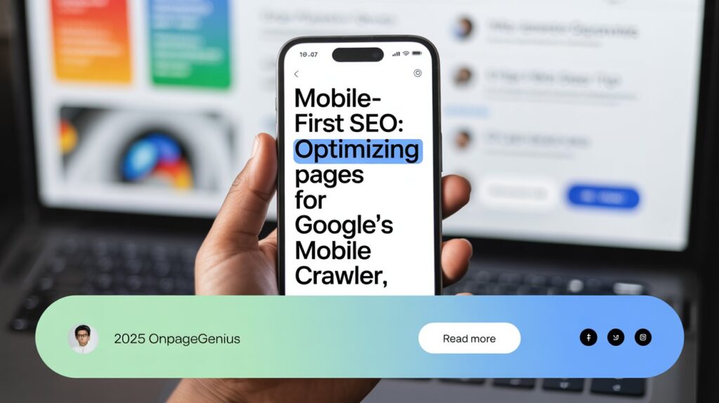
In this blog by OnPageGenius (Kolkata’s leading SEO agency), we’ll guide you through the essentials of Mobile-First SEO and how to optimize your pages for Google’s mobile crawler.
What is Mobile-First Indexing?
Simply put, mobile-first indexing means Google primarily uses the mobile version of your website to determine its rankings. In the past, Google’s crawlers focused on desktop versions. But as mobile usage skyrocketed, Google made mobile the priority.
Important: Mobile-first doesn’t mean mobile-only. Desktop sites are still indexed—but mobile usability now has a much bigger impact on SEO performance.
Why Does Mobile Optimization Matter for SEO?
If your website isn’t mobile-friendly, you risk:
- Lower search rankings (since Google favors mobile-optimized pages)
- Higher bounce rates from frustrated users
- Loss of traffic and conversions
On the flip side, a mobile-optimized site ensures:
✅ A better user experience
✅ Faster page loading
✅ Improved visibility in search results
Best Practices for Mobile-First SEO
Here’s how you can prepare your website for Google’s mobile crawler:
1. Embrace Responsive Web Design
Responsive design means your site’s layout adapts to any screen size—mobile, tablet, or desktop. This is Google’s recommended approach because it provides a seamless experience across devices.
Pro Tip: Avoid separate mobile URLs like m.yourwebsite.com. They’re outdated and can cause SEO headaches.
2. Ensure Content Parity Across Devices
Sometimes, websites strip down content on mobile versions to make pages “lighter.” Bad idea.
If your mobile site is missing key content (text, images, videos, structured data), Google won’t see it either. Ensure the mobile version reflects the same valuable content as your desktop site.
3. Boost Mobile Page Speed
Mobile users expect fast-loading sites. A 1-second delay can drop conversions by 7%.
To speed up your mobile pages:
- Compress and optimize images
- Minify CSS, JavaScript, and HTML
- Enable lazy loading
- Use browser caching
- Implement a CDN
Test your site with Google PageSpeed Insights and take actionable steps to improve.
4. Enhance Mobile User Experience (UX)
A mobile-friendly site isn’t just about fitting content on a small screen. Focus on:
- Readable font sizes (at least 16px)
- Tappable buttons with enough spacing
- Avoiding intrusive pop-ups
- Simplified navigation
Use Google’s Mobile-Friendly Test to spot and fix usability issues.
5. Optimize Structured Data for Mobile
Structured data (schema markup) helps Google understand your content. Ensure it’s consistent across desktop and mobile versions.
Test your structured data with Google’s Rich Results Test to ensure everything is working correctly.
6. Local SEO Matters for Mobile
Most mobile searches are local. If you’re a business targeting specific regions (like Kolkata or anywhere in India), optimize your local SEO:
- Keep NAP (Name, Address, Phone) information consistent
- Optimize your Google Business Profile
- Add local keywords naturally
How to Test Mobile Optimization
Here are some free tools to evaluate your mobile SEO readiness:
- Google Search Console’s Mobile Usability Report
- Mobile-Friendly Test by Google
- Chrome DevTools for mobile emulation
Regular testing ensures you stay aligned with best practices.
Final Thoughts
As Google continues to refine its mobile-first approach, businesses that prioritize mobile optimization will see better SEO performance, higher engagement, and stronger conversions.
At OnPageGenius, trusted SEO specialists, we help businesses navigate these changes with tailored mobile SEO strategies.
Get Free SEO Audit